

tabxplor makes cross-tables and regression models
readable at a glance for data exploration. It builds a table with
percentages, weighted counts, confidence intervals, tests — and colors
highlight the cells that stand out from the total or reference, only
when the difference is statistically solid, to spot the structure of
your data immediately.
theme = "print_ready" renders the
same reading for journals.tibbles you can keep
working on with dplyr. Cells are rich values, each
one carries its count, percentage, confidence interval and reference
behind the displayed number.The tables below are screenshots of the package website, where they are live html: GitHub strips the colors out of a README. Above each one is the code that built it.
install.packages("tabxplor", dependencies = TRUE)

# Development version:
# install.packages("devtools")
devtools::install_github("BriceNocenti/tabxplor")
The point-and-click interface is a jamovi module, installed by sideloading a file. Install jamovi first – the solid release its download page recommends – then take the file for your computer:
| jamovi 2.7 (solid) | jamovi 28 (current) | |
|---|---|---|
| Windows | download | download |
| Mac, Apple silicon | download | download |
| Mac, Intel | download | download |
| Linux | – | download |
Your jamovi line is the number in its About box:
2.7.x is solid, 28.x is
current. On a Mac, Apple menu >> About
This Mac: Chip: Apple M… is Apple silicon, Processor:
Intel is Intel.
Then, in jamovi: Modules (the
+, top right) >>
Manage installed modules >>
Sideload >> the arrow in the middle
>> the file you downloaded. It adds a
Crosstables and a Regressions
analysis, whose options carry the names of the arguments documented
here.
Two symptoms worth knowing: if jamovi says the module needs an update, or that it “is either missing or incompatible”, the file is for another jamovi line; if an analysis errors about a package that cannot be loaded, it is for another system. The full, current list of files is always on the releases page.
A simple cross-table with row percentages: shades of blue mean the cell is over-represented compared to the total row, shades of yellow to red mean it is under-represented.
gss <- gss_cat_data_formatting() # a cleaned-up version of forcats::gss_cat

tab(gss, race, party3, pct = "row", color = "difference")
Several column variables can be crossed at once for series of Yes/No
survey questions. With color_signif = "grey_non_signif",
cells that are not significantly different from the total are greyed
out, so every colored figure is a solid one. Use wt = for
weighted or survey data. Example with FactoMineR tea data
:
tea_when_vars <- c("breakfast", "tea.time", "evening", "lunch", "dinner", "always")
tab(facto_tea, SPC, all_of(tea_when_vars), pct = "row",
    levels = "first", na = "drop",
    color = "difference", ref = "first", color_signif = "grey_non_signif")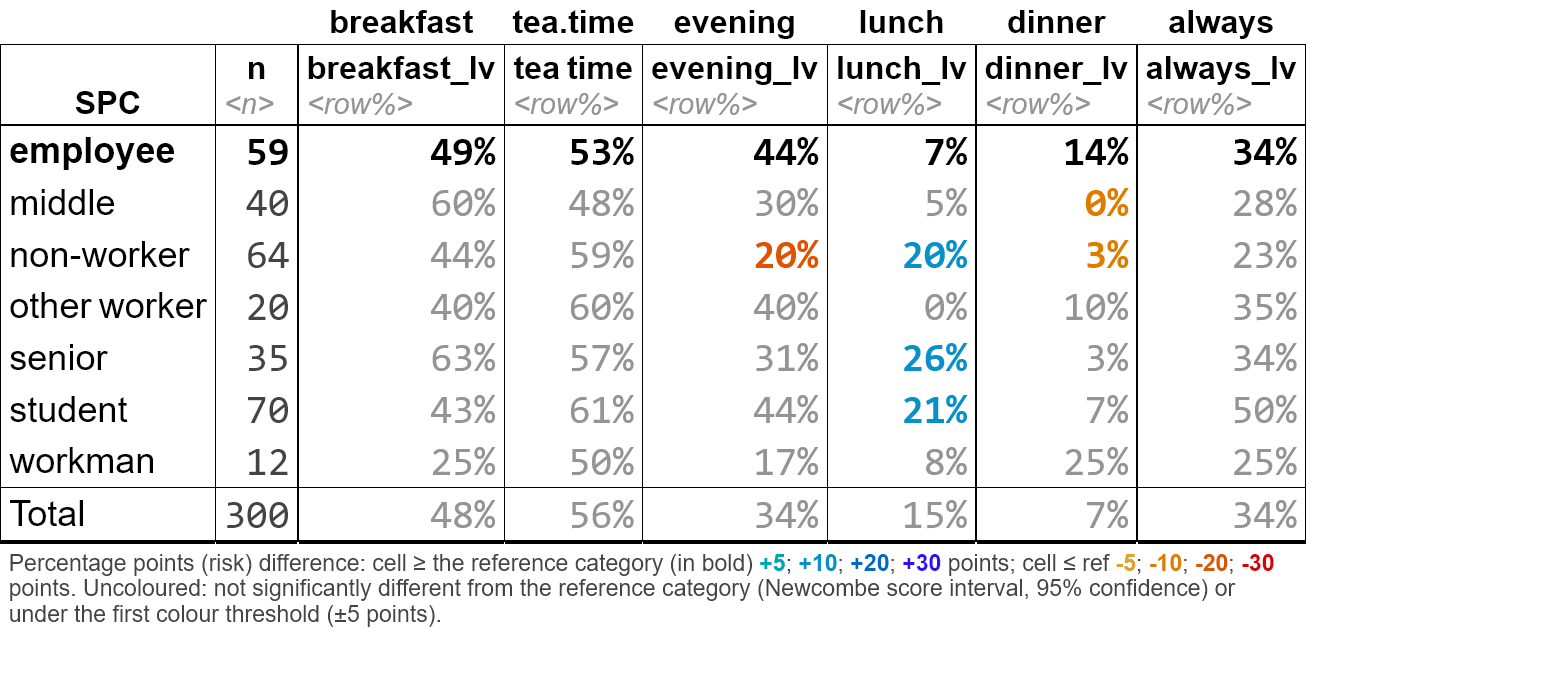
The same visual language extends to regression models:
tab_reg() detects a binary outcome and fits a logistic
regression, coloring odds ratios by strength and greying the
non-significant ones, with a default comparison between the modelised
deviations and their crude/observed counterparts.
tab_reg(gss, outcome = "married", predictors = c("race", "age", "rincome"))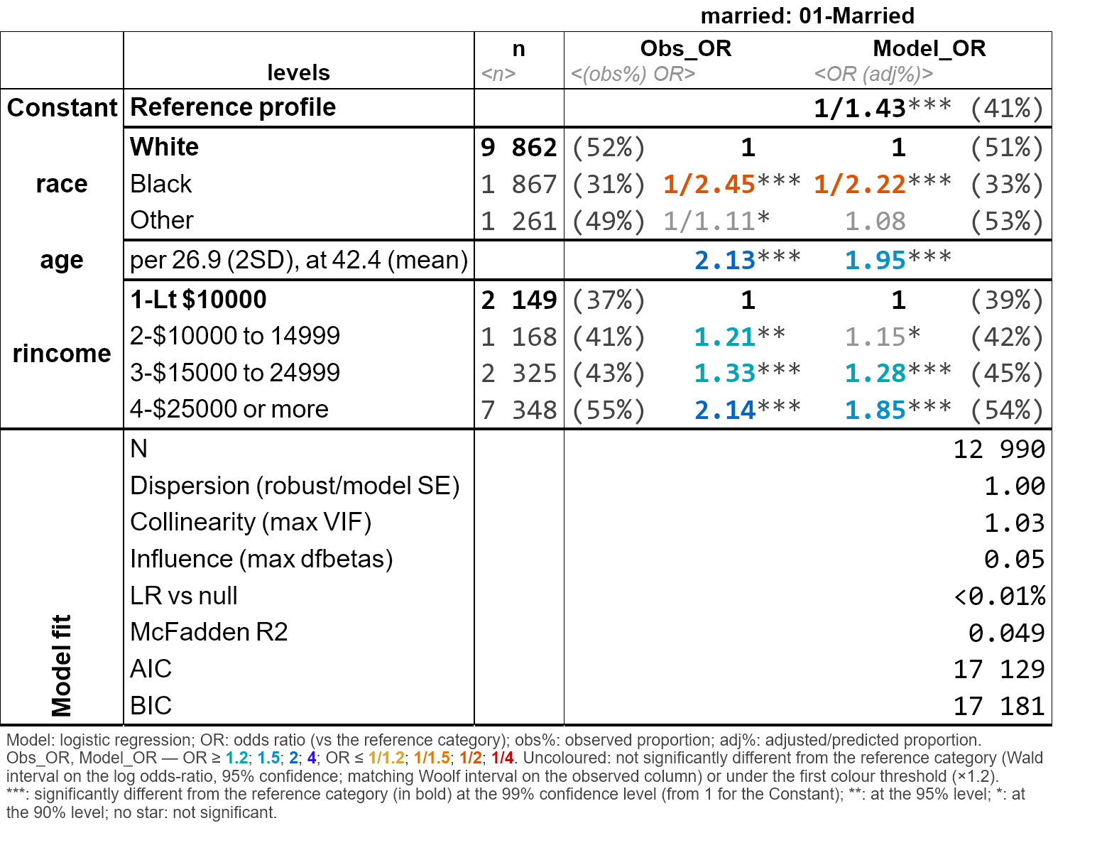

Or as a black and white table ready for publication:
options(tabxplor.theme = "print_ready")
tab_reg(gss, outcome = "married", predictors = c("race", "age", "rincome"))
Any table exports with its colors to Excel, html or markdown (for Word, copy-paste from Excel) :
tab(gss, marital, race, pct = "row", color = "difference") |> tab_html()
tab(gss, marital, race, pct = "row", color = "difference") |> tab_xl()
tab(gss, marital, race, pct = "row", color = "difference") |> tab_xl(theme = "print_ready")